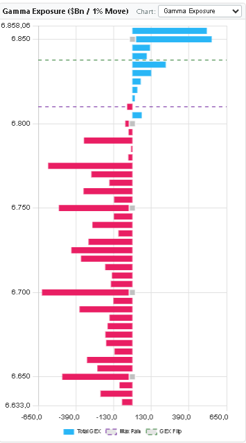
A gamma exposure chart looks like a sideways bar chart — strikes on the vertical axis, gamma exposure in dollar billions on the horizontal axis. Green bars represent net positive GEX at that strike (calls dominant), red bars represent net negative GEX (puts dominant). But most traders who open the chart for the first time make the same mistake: they look at the biggest bar and call it the "important level."
Size matters, but context matters more. A $2 billion call wall at 5,600 means something very different when spot is at 5,580 versus 5,450. The chart is a map, not a signal. The signal comes from understanding where you are on the map relative to where the dealers need to hedge.
This guide walks through exactly how to read that map — in the same order a professional would, before every session. Five steps, five minutes, and you will know which price levels carry structural weight and which do not.
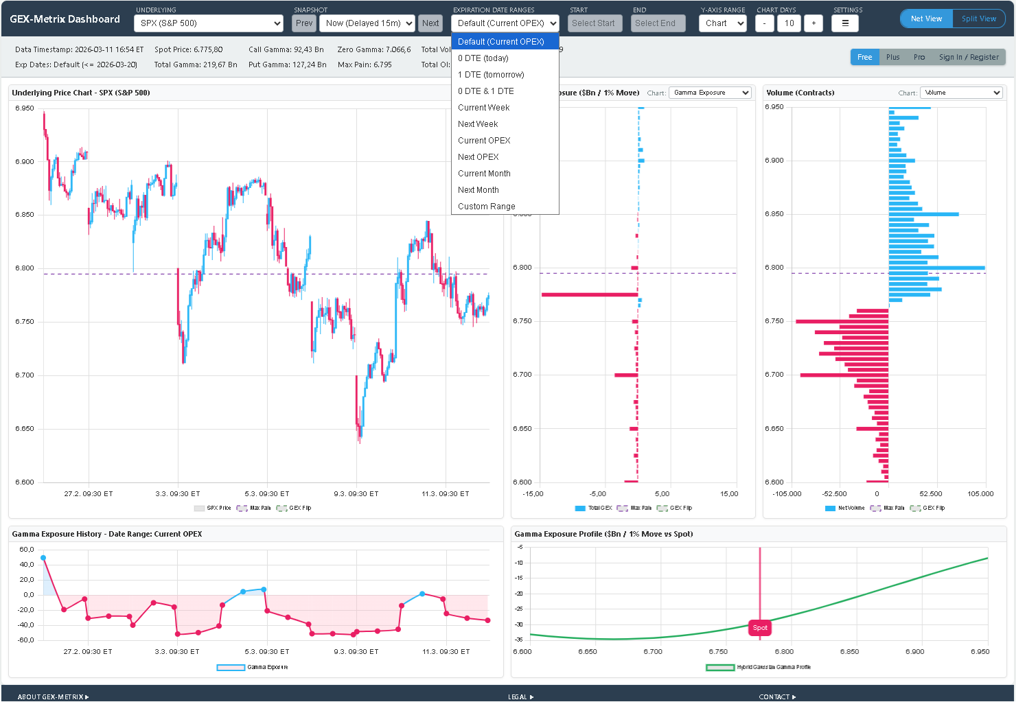
A full GEX dashboard for SPX: strikes on the Y-axis, gamma exposure in $billions on the X-axis. Knowing where to look first is what separates noise from signal.