The core of the dashboard is a double view: two vertical charts side by side, both on the same strike axis and both synced to the underlying price chart on the left. Each slot has its own dropdown, so you pick freely what goes left and what goes right. Gamma Exposure next to Open Interest, gamma next to Volume, whatever pair answers the question you are asking that day.
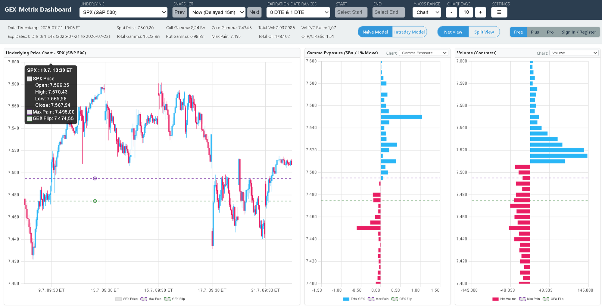
The full dashboard, filtered to 0 DTE & 1 DTE. The underlying SPX price chart on the left, then the double view: Gamma Exposure in the first slot, Volume in the second, each picked from its own dropdown. The strike axis is shared: zoom one chart and the other follows, and both stay aligned with the price chart. Purple dashed line marks Max Pain, green dashed marks the GEX Flip, and the tooltip on the candles carries both levels too. Note the toggles on top: Naive vs Intraday Model and Net vs Split View, plus the summary strip with Spot, Call and Put Gamma, Zero Gamma, and Max Pain.
On the gamma chart I am scanning for two things: where the biggest bars sit relative to spot, and whether one side dominates. A chart with a few tall bars means concentrated positioning and real pin risk at those strikes. A chart with gamma smeared across many strikes usually means a wider, sloppier range. Having Volume in the second slot tells me instantly whether today's trading is actually happening at the strikes where the gamma sits, and because the axes are locked together the comparison is one glance, not two charts and a squint. Swap that slot to Open Interest and the same glance tells you whether a big gamma bar rests on a real pile of contracts.
The expiration filter in the screenshot matters as much as the layout. With the selector on 0 DTE & 1 DTE, everything except contracts expiring today and tomorrow is stripped out, and the walls, Max Pain, and the flip level are recalculated from that subset alone. Near-expiry gamma is the sharpest gamma on the board: it forces the most aggressive hedging and it disappears entirely at the close. When the 0DTE walls line up with the all-expirations walls, those levels carry real weight for the session. When they disagree, the 0DTE chart usually wins the intraday fight and the full chart wins the multi-day one.
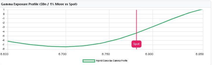
The Gamma Exposure Profile. The green curve is simulated total GEX across the full price range, and the pink Spot line is where SPX trades right now. In this snapshot the curve sits below zero at spot: negative gamma, trending conditions expected.
Then the Profile, which answers a different question: what does total dealer gamma look like at every price SPX could visit today? Follow the green curve to where it crosses zero. That crossing is the Gamma Flip. Everything above it is stabilizing territory, everything below is amplifying territory, and the pink Spot line tells you which side you are on right now. In the snapshot above, spot sits below the flip. I would be treating breakdowns as things that can run rather than things to fade.
The shape of the curve matters as much as the crossing. A steep slope near spot means the regime can change fast; a 30-point move might swing total gamma from comfortably positive to sharply negative. A flat curve means the regime is sticky and today's character probably holds. I also glance at how far spot sits from the flip. Twenty points away is a real cushion. Five points away means the day's regime is one decent push from flipping, and I plan for both scripts. One practical note on the tool itself: the gamma chart, profile, and Zero Gamma level all sit in the Free tier. Delta comes with Plus, and Vanna and Charm sit in the Pro tier.